Table of Contents
Spreadsheets seem very one-dimensional if you don’t know how to use them. They offer a valuable tool that functions as a baseline for extracting data to present and create visualizations.
People who have experience using spreadsheets know how to use them to find patterns and correlations with data.
But the spreadsheets themselves mostly just contain raw data or data that has not yet been filtered. Spreadsheets can be used as a data source to create pivot tables.
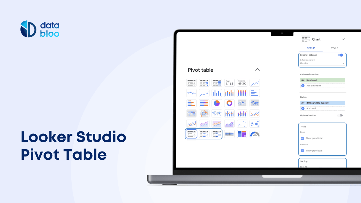
Looker Studio Pivot tables can be created alongside their other visualization charts. They are a helpful source for analyzing and comparing data in specific ways that analysts can easily modify.
Keep reading to learn more about setting up pivot tables in Google Looker Studio (previously Google Data Studio).
What Are Pivot Tables
These data structures reorganize and summarize different rows and columns of data from a larger spreadsheet or database. They generate reports from which to analyze data.
Pivot tables act as a valuable data storytelling tool. They can display multiple dimensions of data at once. This way, analysts can cross-reference data points while looking at them from different angles simultaneously.
This way you can see one piece of data in one category while seeing how it compares within an overall data set, or even how it compares in multiple data sets at the same time.
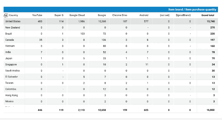
For example, suppose a fashion brand generates reports on how much of each product they’ve sold. Using pivot tables, you can analyze the data through several dimensions, including:
- products sold in each country, state, or province
- products sold in each store location
- products sold by brand or category
- products sold each month or quarter
Two or more of the above items could functionally exist within the same pivot table. All of this information would be valuable for generating reports.
Analysts can easily generate multiple charts from one pivot table by highlighting specific columns or categories. These visualizations work side-by-side with each other and with the pivot table, which functions as the overall data source as well as a visual tool.
Pivot Tables in Google Looker Studio
Spreadsheets and databases display important information in a general format, but the relationship between categories or specific data points may not be immediately obvious.
Therefore, pivot tables, by definition, shift or rather “pivot” specific rows into new columns or vice versa. You can also add new dimensions within each row to further filter data. This allows users to view relationships between data more clearly.
They also spot any anomalies in the data set. Anomalies that become more obvious to identify.
These are the features that you can work with using Looker Studio pivot tables.
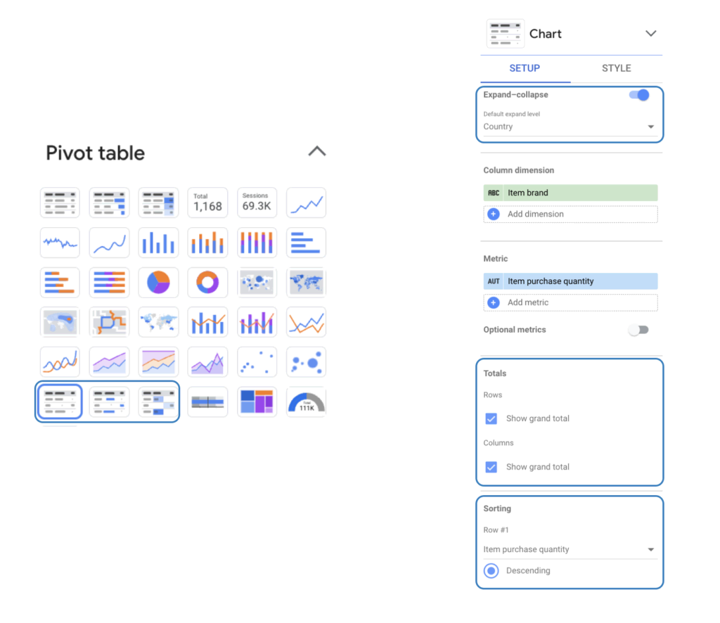
Expand/Collapse
By clicking + or – in the column header of the pivot table, you can display or hide different information. You determine which levels of data should be visible and you can change it at any time.
Showing Totals
Rows and columns display the totals in a pivot table for different categories. The pivot tables allow you to reorganize totals for cross-referencing these totals. You also get to analyze data within more specific contexts.
Sorting
With sorting, you have control over limiting how many rows and columns get displayed in the pivot table. This is how you control the order of the data that can be seen (i.e. descending order by revenue).
How to Build Pivot Tables Using Google Looker Studio
You have your spreadsheets or other data source and have logged into Google Looker Studio. You first select a chart to use, then you configure the chart with the following properties.
Using Set Up Properties
Here you have a setup panel that you can use to determine properties by which you reorganize your data. And this helps you figure out display options for your pivot table.
You can organize your table by data source, which connects specific components of the table to whatever sources you choose. This means that you can change a chart’s data source by clicking on the specific name.
To view or edit data sources, click on the hovering pencil icon. Also, you can click on +BLEND DATA. This allows you to combine data from multiple sources simultaneously, in a process known as data blending.
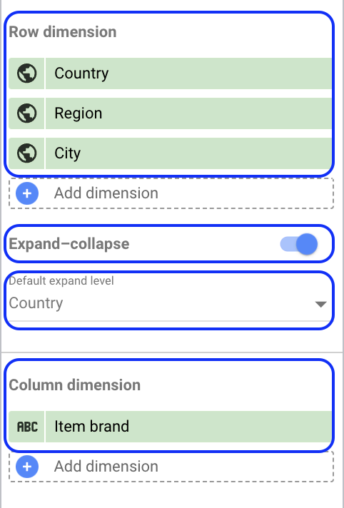
You can also set up pivot tables based on dimensions. Dimensions refer to the categories of data. These can be listed by names, descriptions, or values (i.e. Country, Region, City).
To use dimensions, you have the following options for modifying your table:
- Row Dimensions
- Expand/Collapse
- Column Dimensions
- Default Expand Level
Another option is to set up columns or rows based on date ranges. Like the other Looker Studio Charts, this setting lets you limit the date range for the data included in your charts. It also enables users to limit the time frame of values they compare (i.e. Compared to the previous year or period).
Creating Metrics
Metrics provide the data series and numeric scale used to measure the items within each category of a chart.
Metrics function differently than dimensions because they don’t have their own defined set of values, so you can’t group them.
Apart from the preset metrics, you can also create custom ones from underlying sets of data. You can do this by typing in functions like COUNT (), SUM (), or AVG (). The last function command, AVG, means “average.”
Charts and tables can also be set up to display other options for metrics, which includes the following:
- Totals
- Sorting
- Default date range
- Filter
- Interactions
- Google Analytics segments
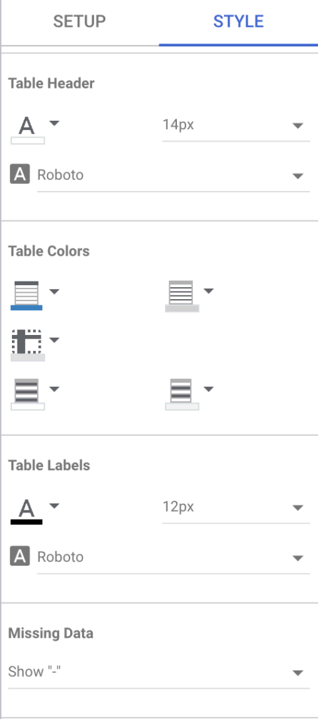
Setting Up Style Properties
Style properties serve as an important setting for helping you modify the visual aspects of the pivot tables. This helps users create the appearance of the overall presentation.
Style properties can be modified based on the following categories, Table headers, Table labels, Table colors, and Missing data.
You can also set up how metrics appear with options like:
- Drop-down menus
- Compact numbers
- Decimal precision
- Show axis
- Show target
Finalize Your Reports With Uniquely-Tailored Pivot Tables
Pivot tables often work like a magic wand with the ways you can switch around how data categories get displayed in presentations. Setting up pivot tables in Google Looker Studio helps you navigate complex data from more than one source.
Visit our gallery to check more visualization templates that can help you upgrade your digital reporting.