Table of Contents
Tearing your hair out with Google Looker Studio?
You’re not alone. While Looker Studio provides potent data analysis capabilities, it can be overwhelming at first.
But with the right guidance, you can master its features and make your data easy to understand.
This guide will help you understand how to use the Google Looker Studio reference lines effectively. Keep reading to learn how to highlight values of interest in your charts and enhance your data visualizations.
What is a Reference Line?
In a nutshell, reference lines are horizontal or vertical lines on a chart.
They can be used as a reference value or benchmark against which other data points can be compared. A reference line can be used to highlight specific values or ranges, making it easier to identify trends and outliers in your data.
For example, imagine you’re analyzing sales data. You could use a reference line to show the average sales over a period, making it easier to see which months underperformed or overperformed. This visual aid simplifies the comparison process and enhances data interpretation.

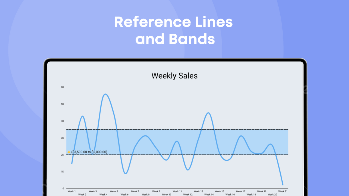
What is a Reference Band?
A reference band is a type of reference line that covers a range of values, providing a visual representation of whether data points fall within a specific range. This can be particularly useful for comparing data against target ranges or benchmarks.
For instance, if you’re tracking monthly sales, you could use a reference band to highlight the range of acceptable sales values. Any data points falling outside this range will be immediately noticeable, allowing for quick identification of underperforming or overperforming periods.
Reference bands can also be used to highlight specific date ranges on the X-axis. This feature is useful in time series charts, where you might want to emphasize a particular period, such as a promotional campaign or a seasonal trend. By using a reference band, you can visually compare data points within the context of the highlighted range, making it easier to draw meaningful conclusions from your analysis.

Reference Lines vs. Trend Lines
While both reference lines and trend lines are useful for data visualization, there are key differences between them.
• Reference Lines: Google Looker Studio reference lines are fixed and serve as benchmarks or targets. They help compare all other data points to a set value. For instance, a reference line can mark the average revenue target for the year.
• Trend Lines: Google Looker Studio trend lines fit the data points in your chart and show the general direction or trend of data over time. Unlike reference lines, trend lines change based on the data. They are useful for identifying overall trends, such as increasing user sign-ups over time.
Both are useful in data analysis. For instance, a trend line can show the general direction of data (such as the number of new user sign-ups), while a reference line can show a specific target.
Compatible Charts
Looker Studio allows you to add reference lines to various types of charts. Each has its own strengths and use cases.
• Line Charts: Ideal for tracking changes over time, such as annual sales performance.
• Bar Charts: Useful for comparing different groups or categories.
• Area Charts: Great for visualizing volume over time.
• Scatter Plots: Perfect for showing the relationship between two variables.
By adding a reference line to any of these charts, you make your data easier to understand at a glance.
When To Use Reference Lines
So, when should you use reference lines in data presentation? Here are some common use cases:
Tracking Changes in GA4
Google Analytics 4 (GA4) lets you monitor changes in user behavior and website performance, making reference lines incredibly helpful.
For example, you might want to see how website updates impact user activity. By adding a vertical reference line in Looker Studio, you can mark when changes were made and see their impact.
Marking SEO Algorithm Updates
SEO algorithms are constantly changing and evolving. If you’re tracking your website’s SEO performance, a reference line can mark where major algorithm updates occur.
This will help you better comprehend how these updates affect your website in the rankings. If you notice a significant drop in traffic after an update, the reference line can pinpoint exactly when this happened-aiding you in creating a plan of action to adapt. Below you will find an example that shows the organic traffic after a few significant update of Google.

Marking Campaign Launches
You can’t run a successful marketing campaign without tracking its performance.
By marking when each campaign launches with a reference line, you can easily see how a campaign affects your various metrics. Whether you’re tracking website traffic, sales, or social media impact, a reference line helps you understand how your campaigns are performing.
A/B Marketing Tests
A/B testing involves comparing two versions of a marketing asset such as a promo banner or even an entire landing page to determine which gives the best results.
A reference line in Looker Studio helps you understand the impact of your tests and understand how your marketing efforts are affecting click-through rates, conversion rates, and other important factors.
How To Add a Google Looker Studio Reference Line
Adding a reference line is a simple process. Follow these steps to add this feature to your charts:
Step 1: Open your report
Open your Looker Studio report. Then click on the “Edit” icon (which looks like a pencil) to enter the report’s edit mode.
Step 2: Edit your chart
Select your chart to which you want to add a reference line. On the right side of the screen, you’ll see the settings panel. Scroll down until you find the “Reference Lines” section, and click on “Add Reference Line.”
Step 3: Customize the reference line
After clicking the plus icon to add the reference line to your chart, you will see multiple options for customizing your reference line, including:
• Type: Choose if the reference line pulls data from a metric, parameter or a constant value.
• Values: Input the specific value you want the reference line to represent.
• Calculation: Select the calculation (median, min, max, total) for a dynamic value (metric).
• Style: Select the line style (solid, dashed, dotted) to best represent your data.
• Label: Add the label for the reference line. Labels add vital context that makes it easier for viewers to understand what each line represents.
• Color: Choose a color that stands out against your chart background. This will help add visual clarity to your reference lines.
After configuring these style settings, go to view mode to see the reference line in your chart.

Adding a Reference Band
You can use the same steps to add a reference band. Instead of clicking on “Add Reference Line,” click on “Add Reference Band.” Customize it with similar settings, including color, style, and values, to create a visual range on your chart. This is particularly useful for highlighting specific value ranges or date periods in your data.
Enhance Your Data Presentation
The reference line and band is a powerful feature you can use in your reports to easily identify trends.
Whether you’re tracking changes in algorithms or your own marketing strategies, reference lines provide a clear point of reference that makes your data easier to understand. The key to effective data visualization is simplicity and clarity.
At Data Bloo, we blend high aesthetics with analytics and advanced charts. Our free audit tool uses features like reference lines to visualize abnormal bounce rates in a given GA4 account. Try our free GA4 Audit Tool and explore our range of templates designed to enhance your reporting experience.