Table of Contents
When you read the news or study most educational content, you have likely encountered a wide variety of map charts. Specifically, maps offer an interesting way to present data in a way that connects certain categories of data or values to different regions or countries.
Maps help people use geography as a tool for data analysis, whether that data is related explicitly to maps and geography or not. Maps offer a creative way of visualizing interesting data stories that appeal to a broad audience.
Google Looker Studio maps allow you to set up data and present it on Google Maps as the visual backdrop.
Keep reading to learn how to do this for your visualization needs.
How to Use Google Maps in Looker Studio
For this to work, you will need to have data sources that include at least one geographic dimension. If you are using Google Analytics (or Databloo’s Analytics4Now) or Google Ads, it comes preset with embedded geographic categories. Some of these categories include the following:
- Country
- Region
- City
- State or Province
These are just some of the most commonly used geographical categories involved in organizing sets or data.
If you use non-default programming like BigQuery or Google Sheets, you want to have geographic categories included as separate columns.
You take the following steps to set up Google Data Studio Maps. First, you edit your data sources, as you do for any visualization. You go through the steps of setting up your reports.
Then, you find which specific geographical dimensions you want to use when you apply Google Maps in visualizing your data. Most importantly, you need to select the exact Geo Field type you need to use to categorize your data.
How Geo Field Dimensions Work
When you select the exact type of geographical field to categorize your data, this influences how the data values show up on the map. Consider how you might use drilling down (another Google Looker Studio feature) and how that affects the presentation of data points.
In the same vein, selecting broader fields or more specific fields, like cities or towns, will be based on what information you want to convey.
When you select what city or country you want to use, you need to make sure to apply the correct codes or the country name. If these fields have standards for formatting data, you want your data sources to be reflective of those standards.
Looking at the Different Map Types
Let’s look into the different options Google Looker Studio maps offers for setting up geographic charts. Each type of map has different configuration methods. The four types of Google Looker Studio maps include the following:
- Bubble maps
- Heat maps
- Filled maps
- Line maps
Below you will find more information on the configuration of each map.
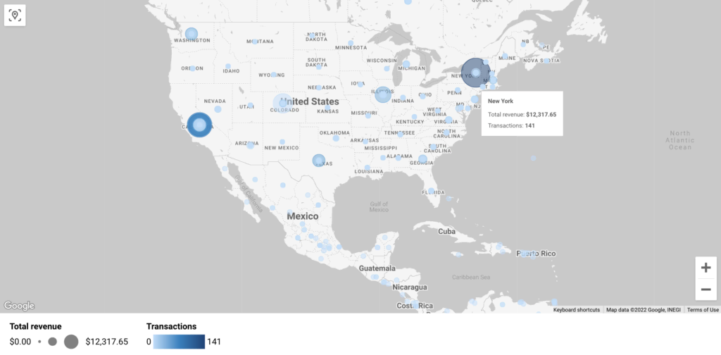
Bubble Maps
Bubble maps refer to the visualizations that show a map that displays data values in the form of specially sized and colored circles, or bubbles. This makes for a visually pleasing and easily recognizable way to find meaning and analyze data, even for non-experts.
To configure bubble maps using Google Looker Studio, you use several different settings.
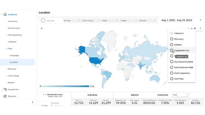
The map needs to include dimensions that set the specific location (i.e. Country / Region / City). Hence the need for the accuracy of codes. Any type of data can be grouped by location.
The other three options for bubble maps include Tool Tips (dimension) Color and Size (metrics). These fields set specific values for each data point. For instance, check the example below:
- Fields: Region
- Tooltip: City (New York) – set up specific labels for each category of data.
- Size: Total Revenue (12.3K)
- Color: Transactions (141)
Bubble Maps can have multiple layers embedded in them, including the following:
- Slider controls which set the size
- Opacity
- Border thickness
- Set the maximum amount of bubbles
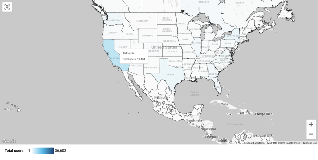
Filled Maps
Filled maps display values based on specific shadings of colors. This could include color gradients that cover a preset color scale, like a rainbow or a partial color scheme. Color gradients for filled maps might also just work with a monochromatic design, relying on several shades of the same color to measure data values.
Just like Bubble Maps, you also can find the location, tooltips, and color dimensions as properties that can be modified.
Other dimensions used for customizing heat maps include Geospatial fields. This means the defined polygons, or types of shapes, that the map fills. The Geospatial field can only be applied when using BigQuery as a data source that has GEOGRAPHY data.
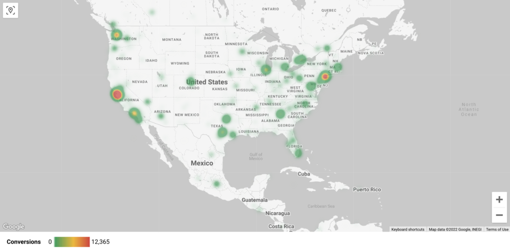
Heat Maps
Heat maps function very much like filled maps. Instead of using specific shapes that get filled in with different colors or shading, heat maps look more organic, using round spots or blotches to measure data values based on a spectrum of degrees.
This functions much like temperature or heat showing up. A dimension option that works for heat maps includes weight. This means how much a value shows up visually on your map.
Theoretically, every data point starts with the same value, but increasing or decreasing the weight determines how the values get displayed visually. This allows for intuitive analyses.
The different style properties for heat maps include the following:
- Minimum and maximum number of shades
- Intensity of values
- Aggregation of Sums and Averages of values
- High or low intensity
Line Maps
Line maps draw lines to represent visual data fields. They rely on the same style properties as the other three types mentioned above.
Line maps can be used when you apply data sources from BigQuery. The configuration of this map is a bit more advanced, as it can load lots of data. Imagine that you can apply filters using up to 1 GB of data. In this post, you will find more information on how to use line maps with BigQuery.
Tell Data Stories with Cool Maps
This article described the different features and dimensions you can modify when you configure Google Maps into your data visualizations. Maps probably serve as the most recognizable way of displaying data, as it’s used almost compulsorily across different media.
Google Looker Studio Maps create visual graphs which can be read by people of all ages and education levels. Non-experts can gain a rudimentary understanding of a specific issue or problem with map visualizations.
They can be a very effective tool for disseminating information, persuading audiences, or displaying geographic trends.
Visit our gallery at Databloo to explore more data visualization templates.