Table of Contents
Did you know that over 55% of all websites use Google Analytics for site content optimization?
Google Analytics is a powerful tool for analyzing and improving your website content. However, its interface can be confusing for novice users. On the other hand, Google Looker Studio provides an easy way to convert data into meaningful graphics and reports.
If you haven’t used Looker, don’t worry; we’ll tell you how to make a Google Looker Studio custom report. That way, you can get your graphs optimized and generate beautiful reports.
Keep reading to learn how to use Google Looker Studio to generate and customize reports for your website.
1. Add the Data Source
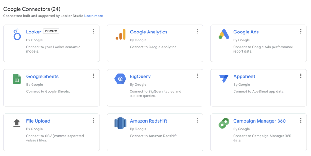
The first step is to connect your data source to Google Looker Studio. This can be from a single or multiple data sources, i.e. web analytics like GA4 and social media such as Facebook and Youtube, to software like email marketing tools.
You will need a connector to add your data source (or sources) into Google Looker. The connector fetches the data from your chosen source and ensures changes are automatically updated on Looker.
The two most common data connectors that you can use in Looker Studio are:
- Connectors from Google
- Connectors from third-party partners
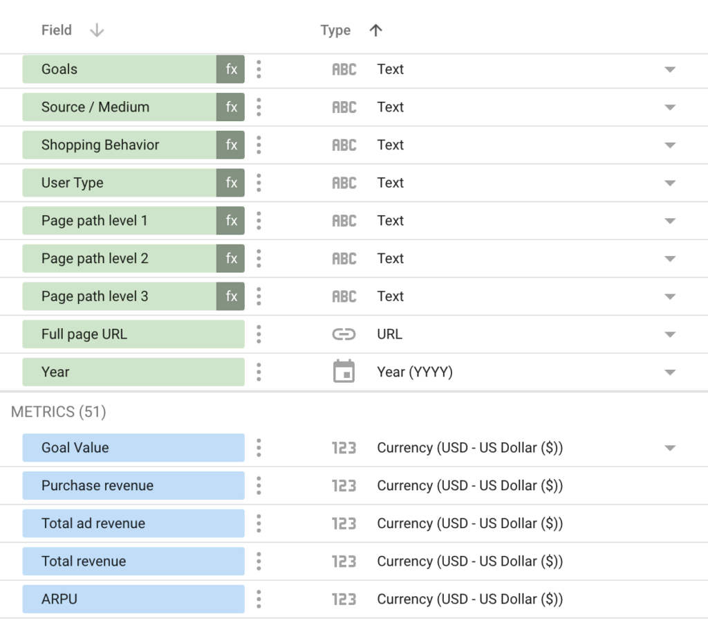
2. Create the Required Metrics and Dimensions for the Report
Once you add your data source, you should check out its available dimensions and metrics that you can use in your report. To calculate new metrics, Looker Studio allows users to create their own formulas (like you would in a spreadsheet) – also known as “calculated fields.”
There are two types of calculated fields that you can create:
- Chart-specific calculated fields
- Data source calculated fields
Google Looker also provides a list of functions you can use in your calculated fields. You’ll find standard aggregation functions and practical functions for managing geographical data.
To get started, you’ll need to make a report in Google Looker Studio, and you will need to have some data on hand. So if you haven’t done this yet, use a connector to fetch the data you want to work with.
Once you’ve extracted the data, you can then create your own calculated fields on the new report to manipulate the data. This will allow you to develop useable metrics that can be presented in graphs or charts.
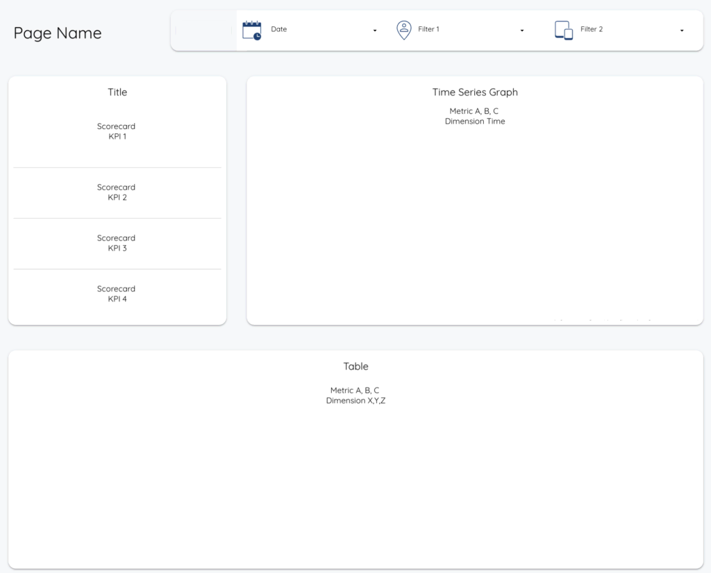
3. Sketch a Draft Dashboard Depicting How the Report Would Look
How your dashboard looks will depend on what goals you want to achieve.
Start by asking yourself these questions:
- Who is going to use the dashboard?
- The main goal of the dashboard?
- What are you trying to show with the data?
- Are there any parts of the data that you have trouble with?
- Which metrics are crucial for your business?
It can also help to do a rough sketch on paper of how you would like your dashboard to look. If you prefer to sketch using your computer, then Canva is a free tool for getting a rough sketch together.
This is also a great way to help you visualize and decide on the priority of the data on your dashboard.
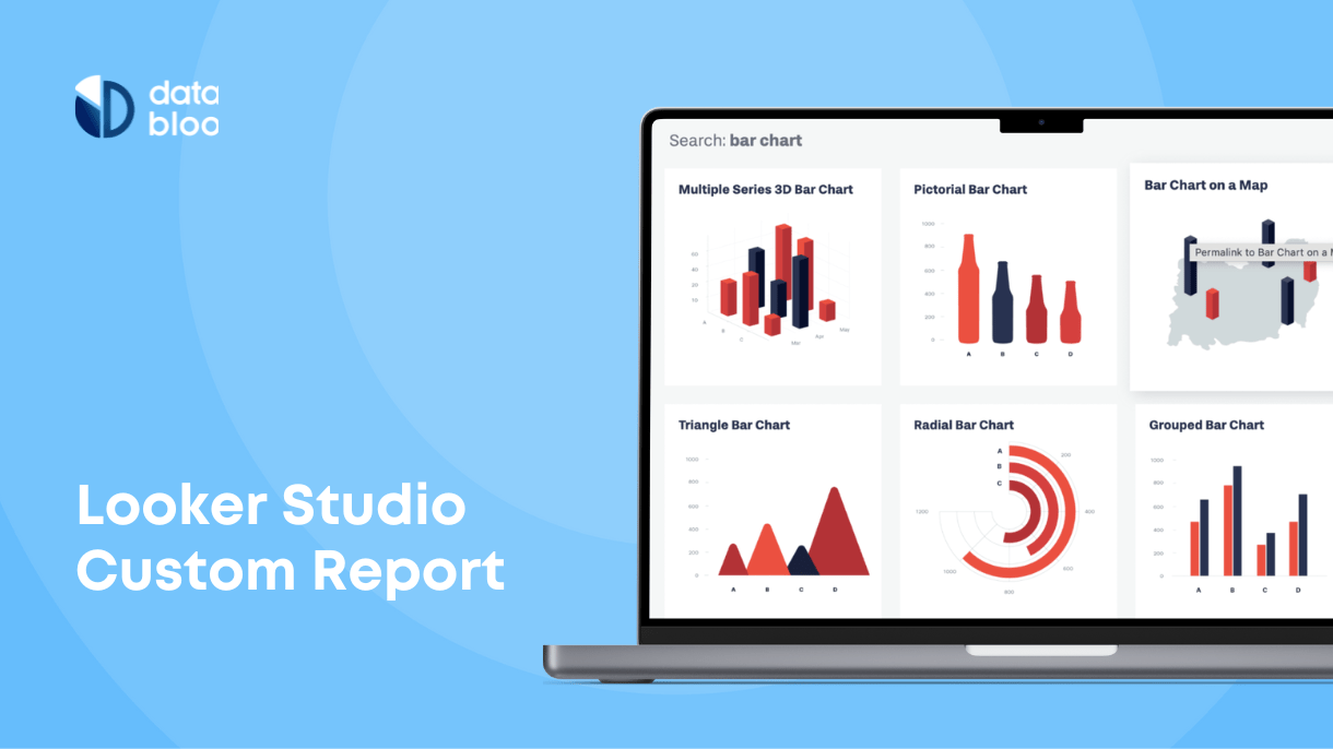
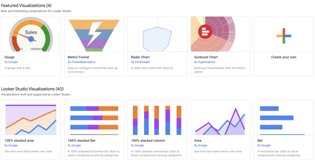
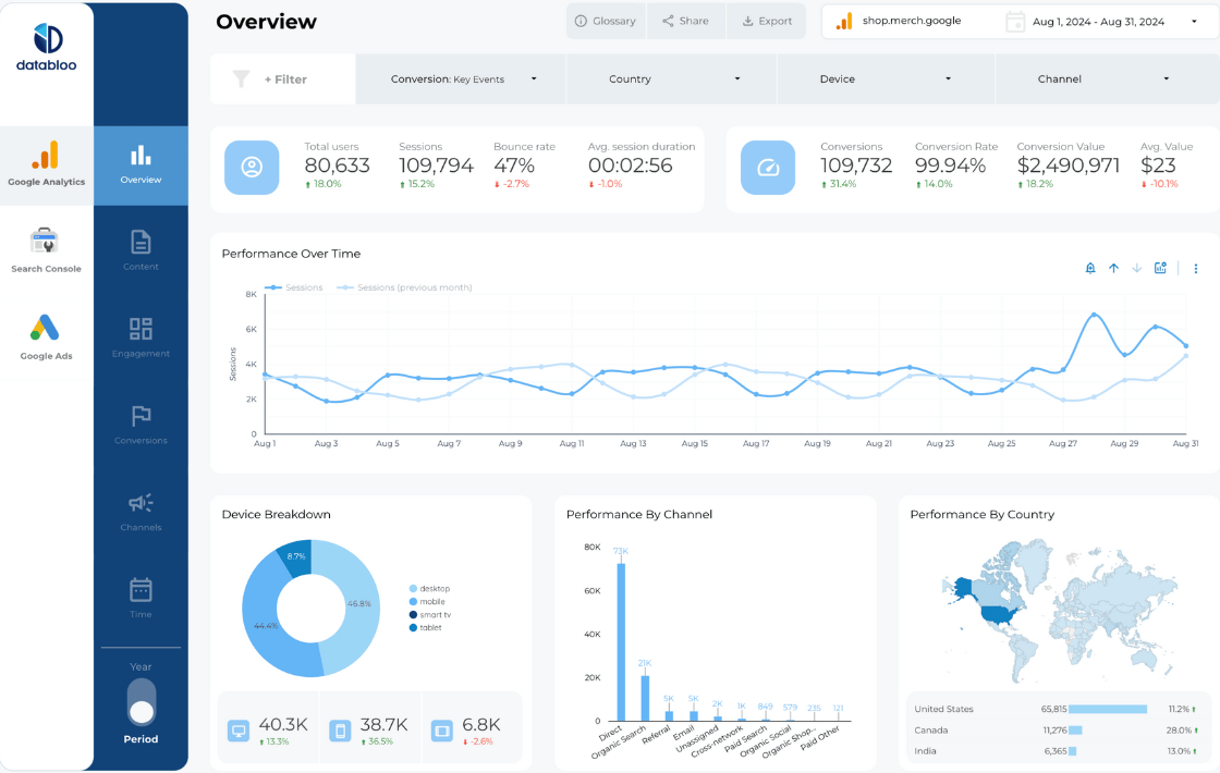
4. Decide Which Type of Charts to Use
There are many ways to present your data. It can be a line graph, a bar chart, a pie chart, or a scatter plot to name a few. But what is the best way to represent your business metrics?
While Google Looker Studio has its own list of charts and graphs you can use, it’s not very helpful in giving pointers on data visualization. But there are alternative resources that you can use, like Dataviz Project.
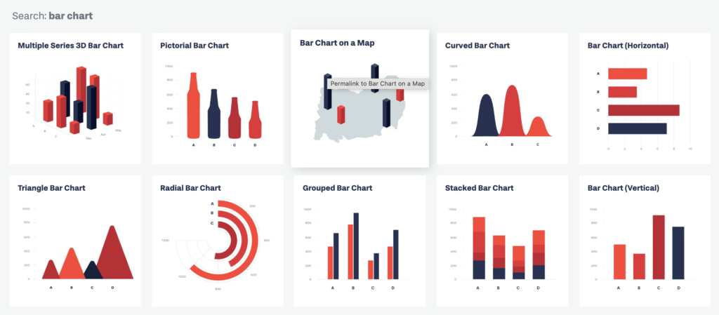
Both of these websites have a large selection of different charts and graphs. All you need to do is put in the type of data you have, and the website will bring up some recommendations. You can then go back to Looker Studio and select from the list of charts/graphs.
However, the range of charts in Looker Studio is not as extensive as the ones on the Dataviz project. But Looker Studio does allow you to add visualizations from third-party developers. You can find this button in the top bar of the report under “community visualizations.”
5. Create the Report Navigation
Now comes the UX design – how viewers will navigate the dashboard. You’ll need to consider which sections on your dashboard will lead to other pages displaying your charts and graphs.
Designing your dashboard can seem intimidating, but looking at other designs will give you an idea of how to put one together yourself. You can also try out some of our pre-made templates to simplify building a dashboard in Looker Studio.
6. Build the Google Looker Studio Custom Report
Now that you have your navigation sorted, it’s time for customizing. This can be done in Looker Studio on the “theme and layout” button and will give you options to change the text font, the chart palette, and the dimensions of the chart components.
It’s also a good idea to build a mockup of the dashboard and all connecting pages. This can help you quickly see whether you like how the data has been presented, allowing you to change it before finalizing the design. You can do this directly through Looker Studio or web apps like InVision and Balsamiq.
With apps like InVision, you can also share your idea with others so they can leave feedback directly on the mockup. This can help to speed up the design process, especially when more than one person is collaborating on the report.
Need Some Help?
Looker Studio is a powerful tool that can transform how your business data is presented. The benefits of Google Looker Studio include delivering metrics from a wide range of sources with no coding involved. But building a Google Looker Studio custom report can be much more involved than it appears.
If you’re looking to take your business insights to the next level but don’t want the hassle of doing this yourself, then feel free to get in touch with our experienced team at Data Bloo. Tell us your business needs, and let us build the custom report for you.