Table of Contents
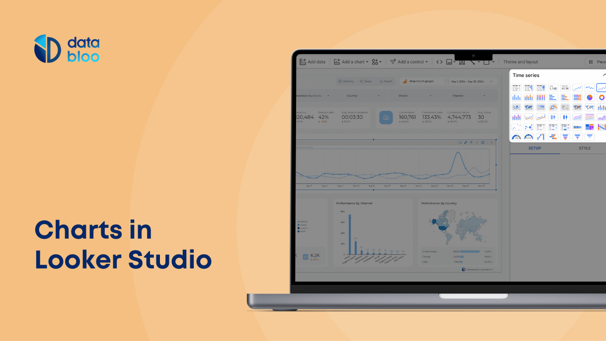
The best part of using Looker Studio (formerly known as Data Studio) is the freedom to customize your reports and graphical representations. This easy-to-use tool lets you visualize the data and share it with your team members and stakeholders, and you can impress them with cool Google Looker Studio charts.
If you are new to using this BI tool, you might not get how to use the available Google Looker Studio charts, graphs and diagrams. But don’t worry we have created this article to help you grasp the different aspects of this amazing tool.
The Google Looker Studio has a wide range of graphical elements – which are commonly called Google Looker Studio Visualizations – which you can use in your reports. Let’s take a look at these.
Google Looker Studio charts
To represent your data you need to add graphical elements or visualizations in your report or presentation. With Google Looker Studio you can include several different types of graphics. Once you have connected with the required data sources, you can add visualizations to show the numbers in your report.
Here are some of the commonly used visualizations in Google Looker Studio:
Charts & Graphs
If you want to make your report look professional you need to add Google Looker Studio charts to represent your data. With Google Looker Studio you can add different charts such as pie charts, bar charts, geo maps etc.
You can also show the changing data trends with a graph in your report. The Google Looker Studio allows you to show the data and statistics through different types of graphs such as line charts, time series, scatter charts, treemaps, and pivot tables, among others. All of these graphs can help you give your report or presentation a more charming design.
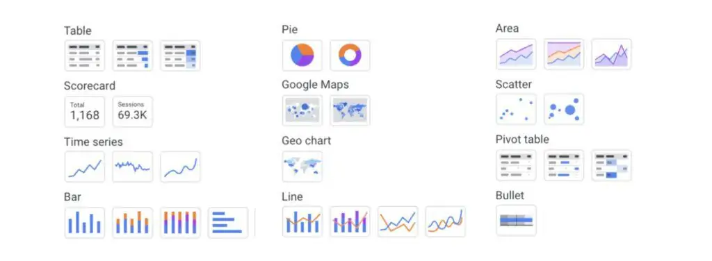
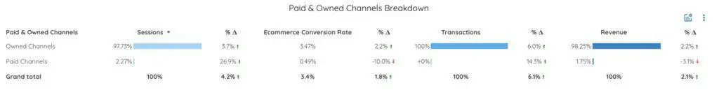
Tables & Pivot Tables
You can use tables in order to analyze your data in more detail. The columns of a table represent one dimension / metric, while the rows are the actual values of your data.
Example: The breakdown of your marketing channels’ performance
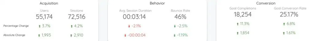
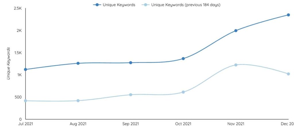
Scorecards
Scorecards are used to present key performance indicators for your business. You can use scorecards in order to underline the difference in performance (Δ% / Δ) vs previous year or period.
Example: Your unique keywords that are ranked on Google over months
Time Series
Time series charts display changing trends in your data over a period of time. You can use them in order to understand your KPIs performance in shorter and longer periods. Tip: Make sure to use date drill down dimensions in your charts, so you can easily analyze the performance per day / week / month / quarter / year.
Example: Your unique keywords that are ranked on Google over months
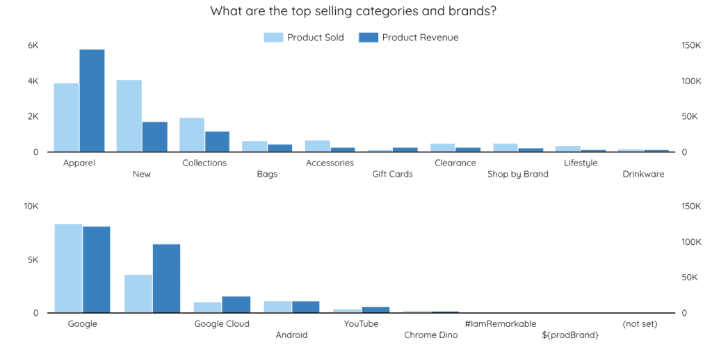
Bar Charts
You can use bar charts in order to showcase the comparisons among different categories. With the usage of bars (Looker Studio offers six different default bar charts) you can easily identify the top performing ones.
Example: Top selling brands and categories of your ecommerce
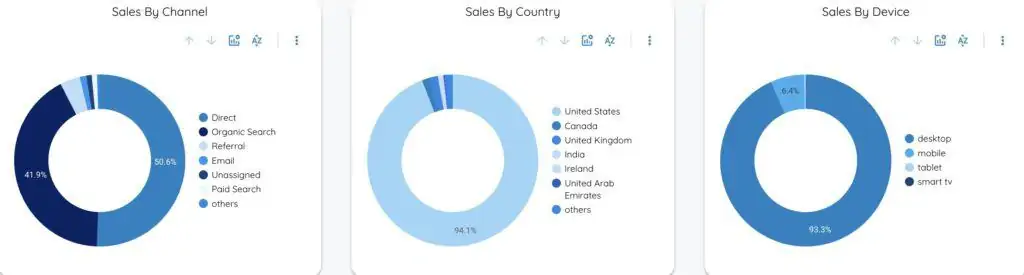
Pie Charts
Pie charts show your data in a circular graphic, which is divided into slices. There are two pie charts available in Looker Studio, the doughnut chart and the whole circle.
Example: Your sales breakdown is based on marketing channels, countries and device categories
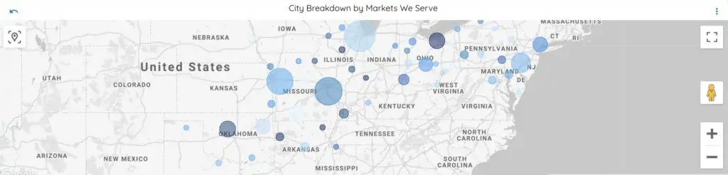
Maps
A map chart shows the performance of your KPIs across different geographic areas. You can use the geolocation dimensions in order to drill down from city / metro area to region / country.
Example: Visits from specific geolocation areas (countries, regions, metro areas) where you serve your clients
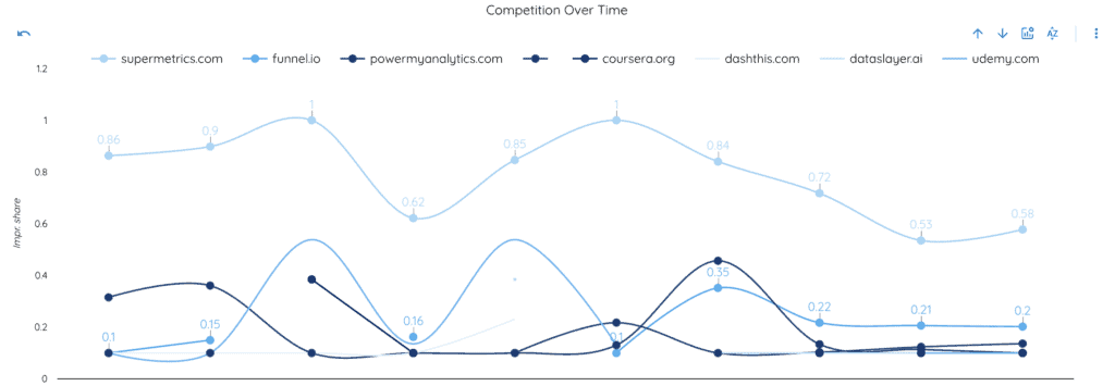
Line Charts
Line charts are used to show changes in your data changes over time along with another dimension. You can visualize your data using either lines or bars (or both).
Example: Impression share of your competitors (vs yours) over time
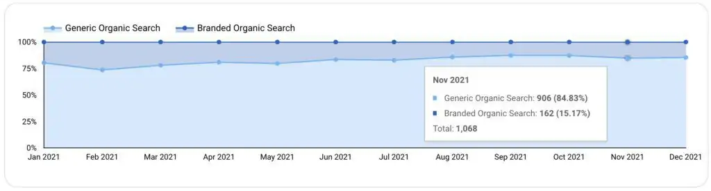
Area charts
Area charts use shaded areas to show the volume of data represented by the lines. You can use them in order to spot trends for more than one dimension over time.
Example: Organic traffic breakdown from search engines.
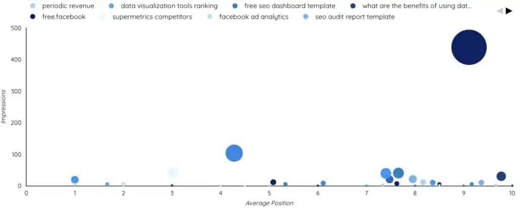
Scatter Charts
Scatter charts display values for two variables of a data source. You can use this combo chart in order to find out correlations between 2 metrics for up to 3 dimensions.
Example: Your ranked keywords of 1st page on search results based on their volumes and their position.
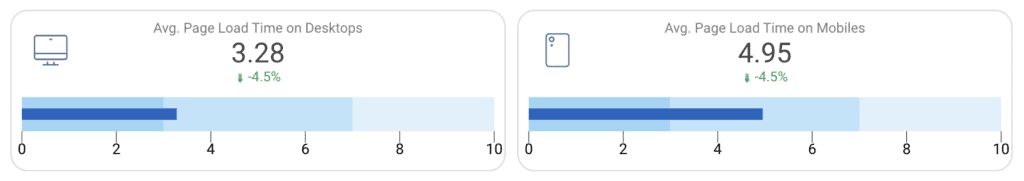
Bullet Charts
Bullet charts are used to show how your KPIs are performing against your targets. With these charts you can set your own targets manually.
Example: Average load time of your website on desktops / mobiles compared to industry benchmarking
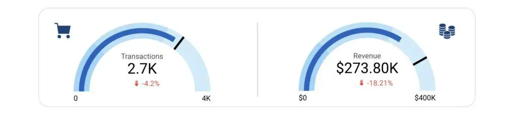
Gauge Charts
Like bullet charts, gauge graphics depict the difference between your actual performance and your target. This chart type is often used in executive dashboard reports to display key business metrics.
Example: Transactions and revenue KPIs of your e-shop against your targets
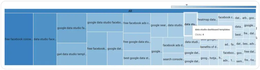
Treemaps
Treemap charts provide a hierarchical view of your data, breaking down your KPI into blocks. You can easily spot patterns based on the size of each block.
Example: Top generic keywords of your website based on the organic search traffic
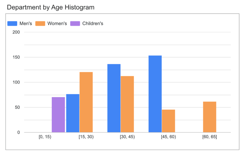
Histogram Charts
Histogram charts are used to visualize the distribution of a single metric by grouping values into ranges (bins). Instead of showing exact values, histograms help you understand how your data is spread — where most values fall and how they are distributed.
Example: You can use a histogram to analyze how conversion rates are distributed across campaigns, or how order values are spread across customers.
Other Diagrams:
Sometimes you might even need to make a diagram to show the processes in your reports. You can add a funnel chart, waterfall chart, a candlestick chart, or customize your own graphical element. When you are making a report you would see all the available diagrams in the toolbar, and you can simply add them to your work.
While there are several graphical elements available in the tool, sometimes you might not find what you are looking for. But you might find the best visual element to represent your data in the elements created by other users.
Community Visualizations
The Looker Studio Community works to add more and more features and visualizations to make it easier to use the tool. You can also become part of this growing community and work along with others to continue making stunning visual representations of data.
The Looker Studio Community Visualizations enable you to customize your own graphical elements. You can use Javascript and CSS libraries to create a graphical element with the style elements of your choice. You can then add this visualization to the gallery.
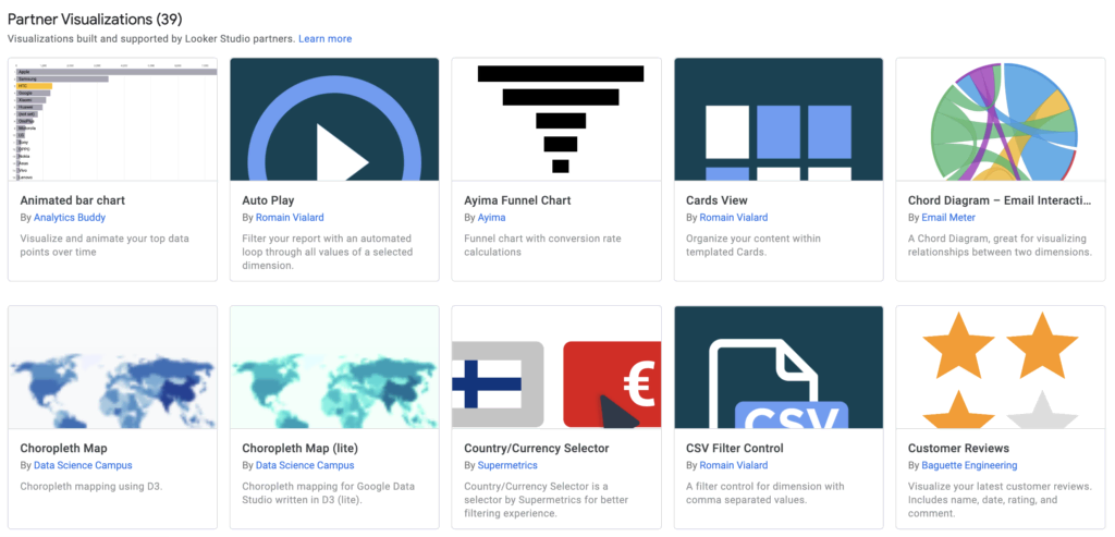
You can also find the community visualizations made by other members in the Community Visualizations gallery, and use them in your reports however you please.
The experience of using Google Looker Studio is made even better by the wide range of visualizations available in the tool. You can take your pick from both the built-in visualizations and the graphical elements created by other users through Community Visualizations. Below you will find some of the community visualizations that are published on Looker Studio Gallery:
Community visualization examples
- Funnel Chart (by Power My Analytics)
- Radar Chart (by Clickinsight)
- Lighthouse Gauge (by James Buckley)
- Data Target Card (by Anvil Analytics)
- Website Heatmap (by Data Bloo)
How to add charts to Looker Studio report
It might seem hard at first, but adding and editing charts is very simple. All you have to do is to:
- Open your report in edit mode
- Go to the top in the toolbar and click “Add a Chart”
- Select the type of chart
- Add the metrics and dimensions you want to display in the chart
- Make the appropriate changes in style tab in order to follow the look & feel of your report
- Adjust the chart to your report by increasing / decreasing its size
And you are all set! You can now pick one of the 13 preset chart types (or even a custom community visualization) and give life to your presentations. Also you can enable modern charts from the theme & layout settings, to bring a fresh look in your reports.