Table of Contents
Data analysis involves a good eye and a knack for storytelling. You want graphs, charts, tables, and all other visualizations to follow a narrative path. Controlling how you present data broadly as well as focusing on more specific groups lets users interact with the story that you tell.
Looker Studio drill-down lets you embed graphs and charts within larger data sets. This helps researchers mine through extensive data in a coherent way to get clear answers and a big-picture perspective.
Each drill down level offers a unique perspective for the viewer. Google Looker Studio drill down features set up the hierarchy of charts and visualizations to report data.
Keep reading to learn more about the drill down technique and how it works.
Understanding the Drill Down Functionality
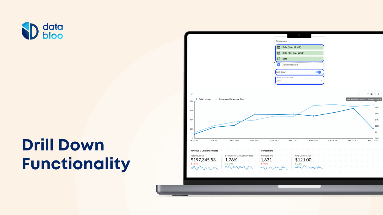
Drill down describes how you can view data through different hierarchical or categorical levels within the same chart. Data analysts accomplish this through a technique called “nesting.” This means you embed different analysis levels as you build your charts.
The drill down Data Studio feature for graphs and charts allows close-up analyses of specific data points. The viewer can focus on particular sets of data points or visualize data more in-depth.
This offers many advantages because it creates an interactive experience for people viewing the chart. Some other benefits include:
- Showing different perspectives on data
- Displaying a large volume of metrics in one report
- Deeper insights and a more thorough analysis
- Creating a user-friendly reporting experience
Implementing Google Looker Studio drill down in your charts makes it simpler to summarize raw data volumes more efficiently than manually clicking through multiple charts. This can improve the power of storytelling in a presentation.
For interactive experiences, you can easily guide users to helpful information with precise details. Drill downs for data reports also create an organized system for your data that makes it easier for users to understand.
How Does Drill Down Work in Looker Studio
When building your reports, you create drill maps, also called drill pathways, to set up available options for mining through presented data. Often this means creating pre-set pathways that users can toggle through.
Drill down charts allow for levels of analysis pre-determined by whoever creates the reports. The lowest level of analysis goes as far as the visualization has been pre-set for.
When generating your reports, you drill down by selecting the drill down feature in the tab for creating charts and graphs. Specific settings include:
- Chart Settings
- Dimension settings
- Category settings
When building the chart, you choose the dimensions for your data. Then, you select what categories you want to use. From there, you can choose sub-categories under each type.
It allows for an analysis that breaks down elements into their basic components. Users can find root causes for problems, tailored solutions, and deeper mining of information for research purposes.
This article provides a helpful guide on implementing drill down techniques in your data analysis.
Drill Down vs. Drill Up
When sorting through data reports, users can shift through dimensions and categories in more than one direction. Two directions you can move through using data drilling include the following options.
Drill Down
This article has singularly focused on drilling down into data charts. This means you start from the broadest category of data.
Imagine using a microscope in a sense to mine through a report’s data. The microscope allows you to zoom in to the most refined level of detail the further you go.
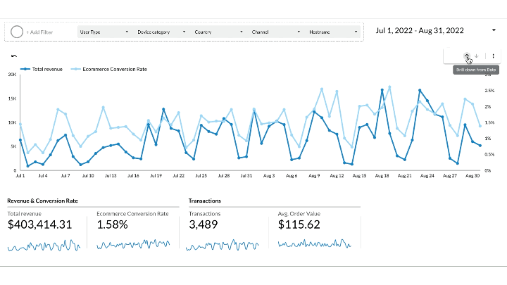
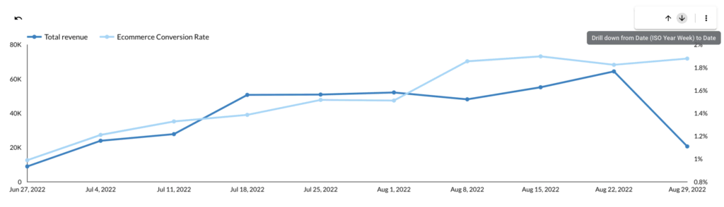
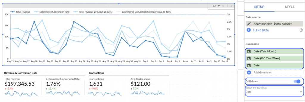
An example could be showing the number of books sold by a bookstore during a sales quarter. To drill down, you might chart the number of purchases narrowed down by genre or by the author’s name. Another example is the Ecommerce analysis over time, going from Month to Week and from Week to Date.
Drill Up
Drilling up refers to when you want to zoom out to more generalized categories of your data.
It’s similar to when you look at a digital photo zoomed all the way in so you can see the pixels. Drilling up is like when you zoom out further and further until the photograph becomes more precise and you see a human face.
For example, your presentation shows a chart detailing standardized test scores for third graders. Drilling up, you would move to a broader category to see test scores for the entire school, the whole school district, and then the state. Also same applies to time analysis, by going from Date to Week and from Week to Month, etc.
How to Use Drill Down Charts in Looker Studio
Looker Studio allows you to embed different levels or hierarchies of data in your charts. We have outlined the steps for creating drill down features in Looker Studio below.
To turn on the drill down feature, you do the following:
- Click on the link that says “Edit your report”
- Select which chart you want to use
- Find the properties panel on the right side and click “SETUP”
- Find “dimension” and click to select “Drill Down”
- Add custom dimensions to your chart
- Choose as many levels of detail as you wish
- You can also select “default drill down level”
To drill down to all levels, you do the following:
- Click to view (or edit) your report
- Find a chart with drill down functionality turned on
- Right-click the chart to select “Drill Down” (arrow down)
- To drill back up, right-click and select “Drill Up” (arrow up)
View Google Looker Studio’s help page to learn more about setting up Drill Up options for your charts.
Four Google Looker Studio Drill Down Examples
Let’s demonstrate how you can implement drill down in the Looker Studio. Here you will see four different charts in which you can drill down to view selected values and categories.
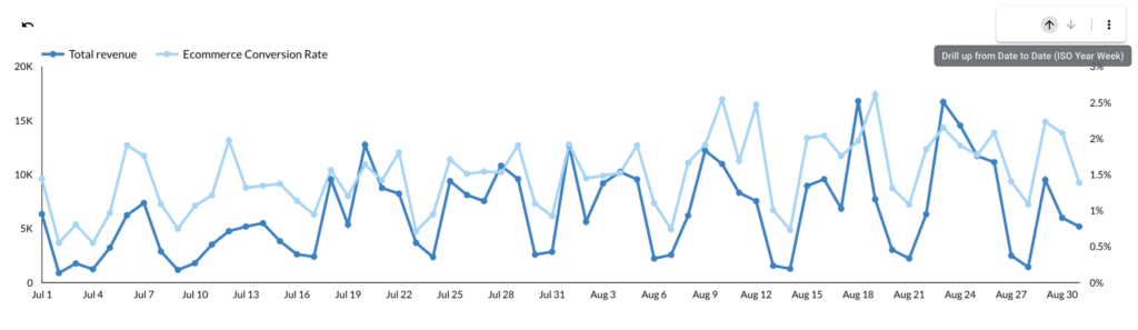
Time Series Chart
This chart shows a drill down in a time series. By using this chart you can drill down from month to week to date and easily spot revenue trends over time.
Bar Chart
This chart demonstrates drill down in a bar chart. This is one of Databloo’s featured templates. Like the above example, you can track revenue data with quarterly, monthly, and weekly tabs.
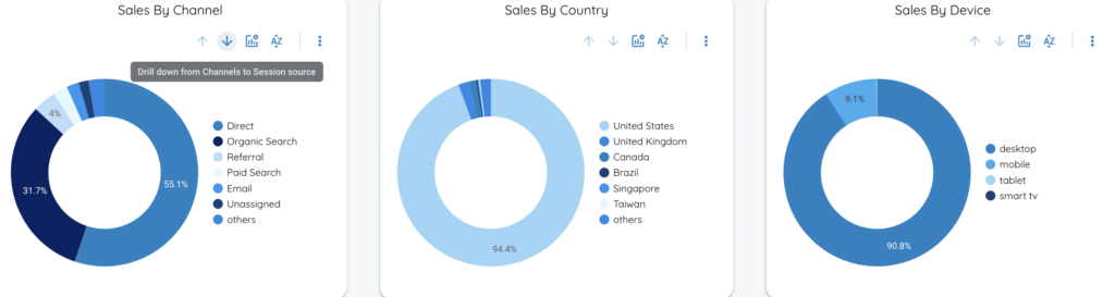
Pie Chart
Now, check out an example of a drill down in a pie chart. Here is a template from Data Bloo’s Analytics 4 Data. These pie charts demonstrate the sales by Channel (drill down to source and medium), by Country (drill down to region and city) and by Device (drill down to device brand).
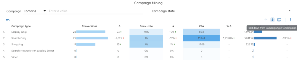
Data Table
Lastly, this visual demonstrates drill down in a table. This template shows an example of a visualization tracking Google Ads campaigns (drill down from Campaign Type to Campaign to Ad Group).
Creating an Optimal Interactive Experience
Storytelling with data can be a powerful tool when used well and with the right eye for design. It helps to gain practice in adding drill down features to your charts in your reports.
You want the data to speak for you. Showing rather than telling leaves a much bigger impression on your viewers. Looker Studio drill down allows for easy customization and reversible features.
Data Bloo has several templates featured on Google Looker Studio. Visit our gallery to see how our charts and can upgrade your digital reporting in minutes.