Table of Contents
Sixty-three to seventy-three percent of the average company’s data goes unused. Any company that ignores this data is probably not using bar charts to make their information more legible. As a result, company heads may not improve their company as much as they’d wish.
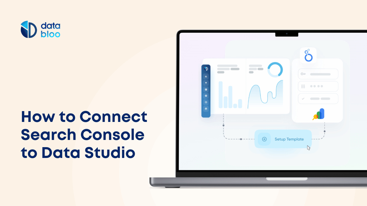
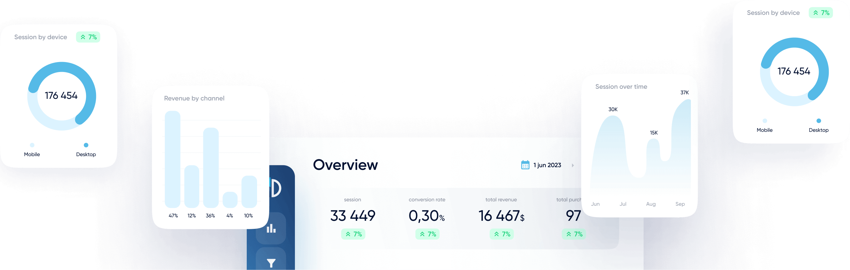
Bar charts are one of the most effective ways to visualize your data, making complex information easily understandable at a glance. They allow you to compare different groups and identify trends, helping you make better decisions. Google Looker Studio offers robust bar chart options that can transform your raw data into actionable insights. If you want to know how to create and utilize these bar charts, read on!
What Is a Bar Chart?
A bar chart (sometimes known as a bar graph) is a chart used to summarize categorical data sets. It displays data by representing it as a set of bars. Each bar (sometimes several bars) represents a particular category, like age group or race.
The height (in a vertical bar chart) or length (in a horizontal bar chart) of each bar represents particular values related to the categories the bars represent. One axis of a bar chart displays the categories, while the other axis displays the values.

Bar Charts in Google Looker Studio
Several of the options for displaying your data in Looker Studio are different types of bar charts. They’re very useful when you want to compare the values of different categories.
When to Use a Bar Chart
Bar charts are used to compare a few different groups based on the data records for each of them. Having this comparison can make it easier for someone to make a claim based on how groups differ. For example, an eCommerce company can analyze purchase data and discover that young women are the primary buyers of a new clothing line. This insight can help the company tailor its marketing strategies to target this demographic more effectively.
Use a bar chart if you need to prove something similar. They are particularly effective in scenarios like comparing sales performance across regions, product popularity, or customer demographics. For instance, in an Ecommerce Revenue report, bar charts can effectively display the revenue and quantities of best-selling brands and products over a given period, helping to identify top performers and inform inventory and marketing decisions.

Available Types of Bar Charts and Functionalities
There are two different bar chart functions you can use for a Google Looker Studio data report. One of them consists of a single dimension with multiple metrics, while the other consists of two dimensions with a single metric.
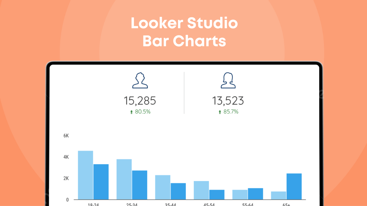
- Single-Dimensional Bar Charts: In these charts, all categories (or series) have one column with no divisions. In Looker Studio, you can use this type to analyze a single category and up to 20 metrics, like in the below example for keyword ranking distribution.

- Two-Dimensional Bar Charts: These charts have multiple columns per category, often referred to as “applying a breakdown dimension to the primary dimension.” You can measure that breakdown with a single metric or you can add more optional metrics. Using the demographics breakdown (age/gender), you can analyze purchases and the amount spent on ads, providing a comprehensive view of how different demographic groups contribute to sales and marketing expenditures.

In addition to these functions, there are four types of bar charts you can use with Looker Studio:
Stacked Bar Chart
A Google Looker Studio stacked bar chart is a type of horizontal bar chart where different breakdown dimensions are stacked horizontally instead of placed side by side. This makes it easy to compare the cumulative total across different categories. In below example you can monitor the engagement in terms of likes and comments of an Instagram account based on the type of media (feed, reels, stories etc.). This allows for a clear comparison of overall engagement across various media types, highlighting which types perform best.

100% Stacked Bar Chart
This type of vertical bar chart stacks dimensions horizontally, but each series column is represented as a percentage of the total. This is useful for comparing the proportional distribution across different categories.
Column Chart
A column chart, also known as a vertical bar chart, displays the breakdown dimensions side-by-side. This format is ideal for comparing different groups or categories with clear, distinct values.
Stacked Column Chart
The stacked column chart is the vertical version of the stacked bar chart. It stacks the dimensions vertically, and each series can be compared as a part of the whole within each category.
The Anatomy of a Bar Chart
As mentioned, bar charts have several components. Understanding these components can make it easier to use tools like Looker Studio effectively. Here’s a breakdown of these and their definitions.
- Title: The name of your bar graph, usually describing the contents clearly and accurately. It is placed at the top of the chart.
- Series/Categories: The categories or series are the different parts of a particular metric such as age group, geographic location, etc.
- Scale: A data set with various values (usually numerical) that corresponds to the categories. For example, if the series/categories are different age groups, the scale could be the amount of sleep they get at night.
- Bars/Columns: The bars or columns are rectangular shapes on a bar graph. Each series can have multiple bars. They often have different colors.
- Legends: When there are multiple bars per category, a bar chart needs a legend. This is a guide to what each bar represents based on its color.
- X-Axis and X-Axis Label: The X-Axis is the horizontal line at the bottom of both vertical and horizontal bar graphs. Its label is usually the series in a vertical bar graph. In a horizontal bar graph, the x-axis’s label is the scale.
- Y-Axis and Y-Axis Label: The Y-Axis is the vertical line on the left side of horizontal and vertical bar graphs. In vertical bar graphs, the y-axis is labeled with the scale. In horizontal bar graphs, the y-axis holds the series label.
How to Add a Bar Chart in Looker Studio
Adding a bar chart to your Google Looker Studio report is easy. Follow these steps:
- Open your report: Open your report and switch to edit mode.
- Go to a page: Navigate to the page in your report where you want to add the chart.
- Add a chart: Click “Add a Chart” in the toolbar menu.
- Select the bar type: Choose the type of bar chart you want to add from the dropdown menu.
- Place the chart: Click on the canvas to add the bar chart to your report.
- Adjust its settings: Select the bar chart on your canvas to move or resize it as needed.

Style Improvements in Looker Studio Bar Charts
Do you want to play around with the look of your bar chart even more? If so, there are a lot of options for you in the Style tab of the Properties Panel.
Bar Label Type
It can be difficult to determine the exact scale value of each series dimension. The bar label type allows you to place the value in or on the dimensions.
Dimension Value Color
This controls the color of each dimension. It also keeps your colors consistent for each dimension.
Bar Border Color
You can also change the border colors of bars in a chart. Black outlines can be a great way to separate the bars from the rest of the chart.
Improve Your Visualizations with Our Templates
Now you know how to make Google Looker Studio bar charts. You’ll surely impress your stakeholders with beautiful and insightful visualizations.
Do you want to impress them even more? If so, consider using our Google Looker Studio templates. They feature bar charts, pie charts, and a wide array of other chart types to enhance your data reporting. The best part is you can use our one-click setup process to easily create your own reports with just a few clicks in minutes. With our templates, you can create professional, visually appealing reports that make your data easy to understand and act upon.