Table of Contents
Analytics has become a crucial component for 60% of businesses worldwide. With its ability to streamline operations and drive better business decisions, it’s no wonder it has gained such widespread reliance.
However, let’s face it – numbers can be dull.
Amassing heaps of data doesn’t always result in the most captivating presentations. That is until you discover the power of Looker Studio community visualizations.
These dynamic visualizations can inject much-needed vitality into your charts and presentations, transforming them into engaging narratives.
Curious to learn more about this great feature offered by Google Looker Studio and how it can optimize your data visualization? In this article, we will delve into everything you need to know about Looker Studio community visualizations, complete with a step-by-step guide on how to incorporate these visualizations into your reports.
What Is a Community Visualization?
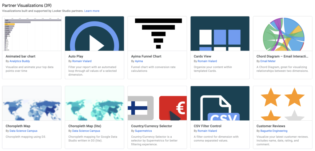
As the name suggests, community visualizations in Looker Studio are a collaborative endeavor. They are developed and expanded upon through the continual contributions of 3rd party developers (partners) within the Looker community.
In simple terms, community visualizations provide users with the option to choose from a range of existing visualizations within Looker Studio or create their own. When it comes to effectively conveying your data narrative, community visualizations empower businesses to tailor charts to align with their brand.
The Advantages of Utilizing Looker Studio Community Visualizations
Irrespective of the industry, incorporating community visualizations can bring numerous benefits to your business. In the sections below, we outline some key advantages:
Increased Flexibility and Customization:
When working with Looker’s community visualizations, you can unleash your inner Picasso. The diverse array of available tools facilitates easy customization, enabling your charts and data reports to align closely with your brand’s voice and style.
Moreover, Looker Studio’s community visualization tools offer enhanced flexibility for data reporting. Rather than being constrained to a specific set of options, marketers can explore various visualization tools to represent their data effectively.
Access to a Wide Range of Custom Charts:
Delving into Google Looker Studio community visualizations is like stepping into a world of charts. Whether you choose to personalize a built-in chart or select one crafted by a 3rd party developer, you gain access to a vast selection of chart options such as funnels, animated bar charts, chord diagrams, and maps.
Furthermore, if you opt for a chart, you can still customize it to suit your preferences.
Enhanced User Experience for Custom Charts:
Google is renowned for its commitment to exceptional user experiences, and this principle extends to the community visualization platform. Looker Studio is engineered with seamless design, making the process of using custom charts effortless for marketers and business owners alike. Rest assured, you don’t need a degree in data science or be an expert to use custom charts within Looker Studio.
If you encounter any challenges along the way, our collection of custom charts can serve as a valuable source of inspiration.
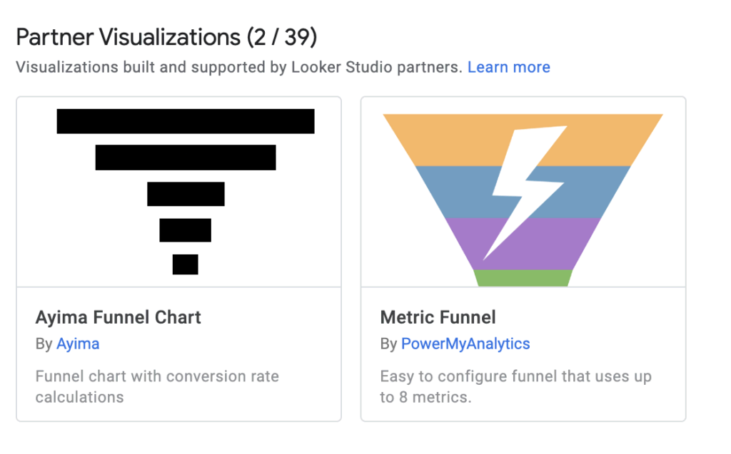
4 Essential Community Visualizations for Looker Studio Reports
When it comes to Google community visualizations, the sky’s the limit. Creativity knows no bounds, allowing you to unlock the full potential of your data reports. In this article, we’ll delve into four types of community visualizations that we consider indispensable for creating impactful reports.
1. Custom Table
Tables are a fundamental component of any data report, but generic data tables often fall short in effectively representing information and trends. You can use the custom table visualization that is developed by Thomas Langnau. This powerful tool puts you in control, simplifying data representation. With features such as CSS input, conditional formatting, and cross-filtering, you can effortlessly convey complex data at a glance. Showcase metric performance over specific time periods and utilize bar charts and heat maps for enhanced trend depiction.
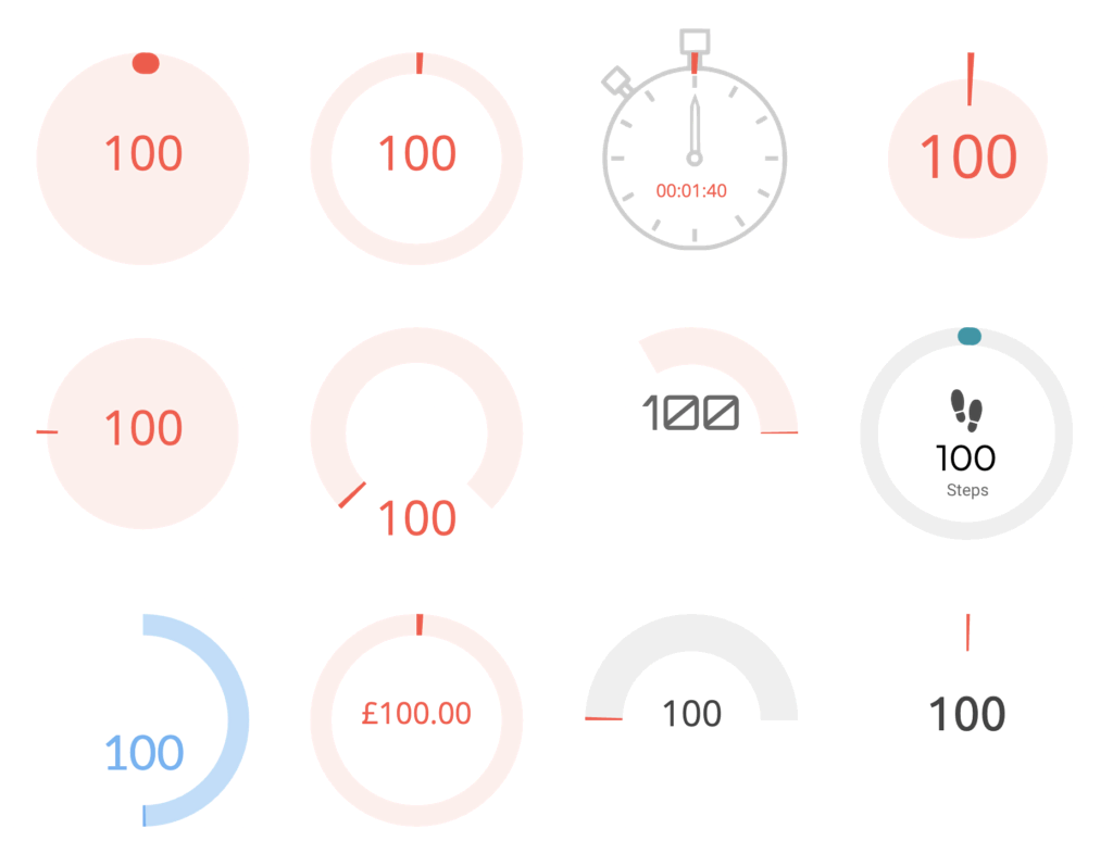
2. Lighthouse Gauge
If you’re familiar with Google Lighthouse for web reports, you’ll appreciate the elegance of the Lighthouse Gauge visualization. Its simple yet captivating design resembles progress graphs. While the design is sleek, it offers ample room for creativity. Customize gauge styles to match your preferences and fine-tune data ranges using minimum, mid, and high values. For a more precise range definition, explore the style tab’s additional options. With primary and secondary color choices per range, you can truly bring your visualization to life. Adjust value precisions, experiment with text formatting, and explore various visual options. The credits for this custom chart go to James Buckley
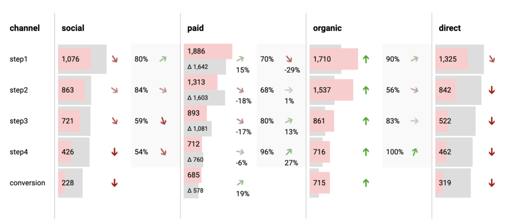
3. Funnel Graph
The funnel graph is a powerful representation of the buyer’s journey, akin to a marketing funnel. By visualizing how your target audience progresses from potential visitors to actual buyers, you gain invaluable insights into your marketing strategy. The funnel graph not only provides proprietary insights but also integrates seamlessly with the Enhanced E-commerce data of Google Analytics. Take control of your data portrayal by experimenting with your brand colors, different funnel directions, and gradient orientations. Choose between a horizontal or traditional vertical funnel display, tailoring it to your specific needs. The funnel graph is developed by TrueMetrics.
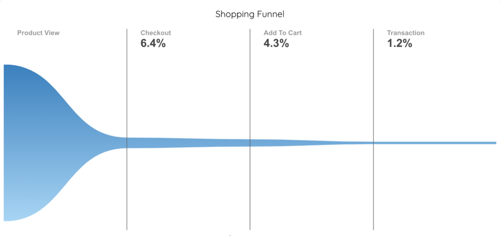
There are some other great funnel visualizations in the community library, that can help you show the the conversion rates from one step to another.
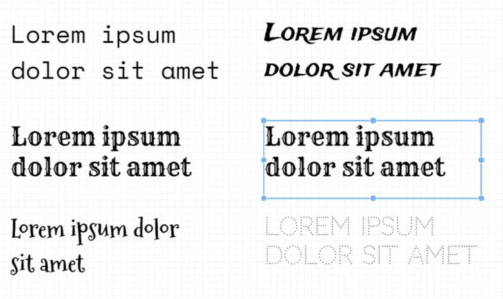
4. Custom Google Fonts
While not strictly a chart, custom Google Fonts deserve a special mention for two reasons: they offer greater creative control and improve the user experience. Before the introduction of this community visualizations, Looker Studio had limited font options. Thanks to the contributions of Ahmed Kanani, custom Google Fonts are now available. This feature empowers you to use any font you desire, allowing for personalized typography. Customize text color, size, and opacity, play with line height, add effects like blur, or even experiment with 3D text.
Adding Community Visualizations to Looker Studio Reports
There are two methods to utilize community visualizations. The first involves leveraging charts from the existing community visualization library, while the second empowers you to add “non-published” custom visualizations (i.e. Google Fonts) by adding their manifest URLs.
Let’s explore the first possibility.
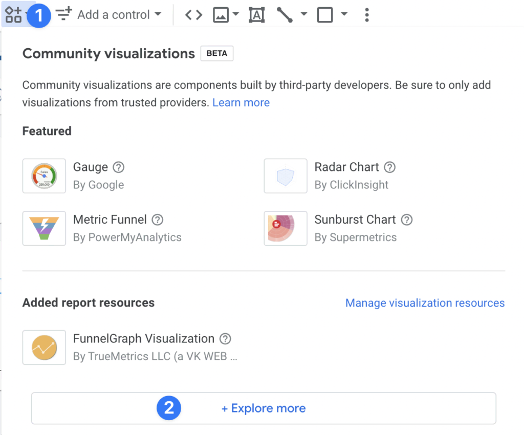
Step 1: Select a Visualization
On the toolbar, select community visualizations and components. There select the visualization you want to add to your report. To select visualizations from fellow developers, click on Explore More.
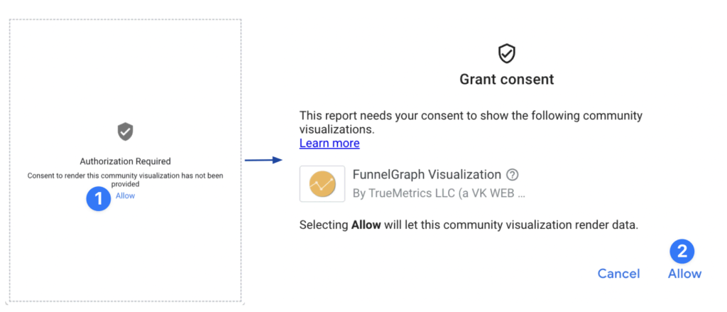
Step 2: Give Consent
You may be prompted to give consent for the visualization to display data. You can retract the permission at any time (Menu > Resource > Manage community visualizations).
But if you don’t find what you are looking for, the next option is to use a custom chart that is not published in the Gallery.
Step 1: Explore More
In the top toolbar, select the community visualization and components. In the drop-down menu, pick +Explore More.
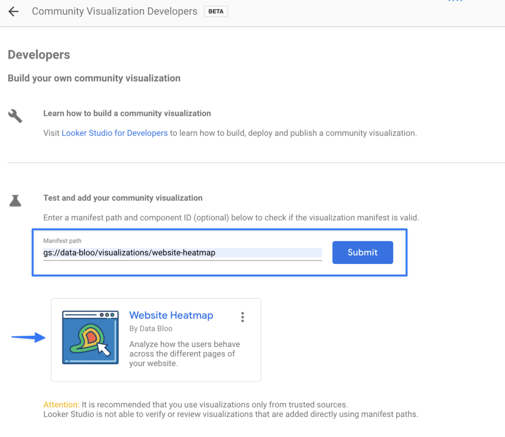
Step 2: Build Your Own
Once the community gallery opens, on the top left click on build your own visualization. Under the test and add your community visualization section, you will have to enter the manifest path. When everything is done, submit.
Choosing the Ideal Community Visualization Charts
To create the perfect data report, you need a combination of Looker Studio community visualizations and default charts. However, if you aspire to elevate your data presentations to new heights, our meticulously designed templates are the ultimate solution as they combine both built-in and custom visualizations.
Get in touch with us today to discover how our products can effortlessly enhance your presentations and make data visualization a breeze.